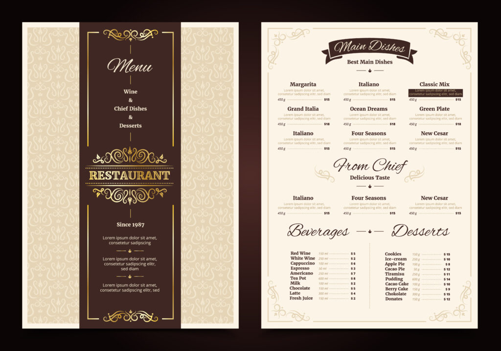
Why Typography Matters in Menu Design
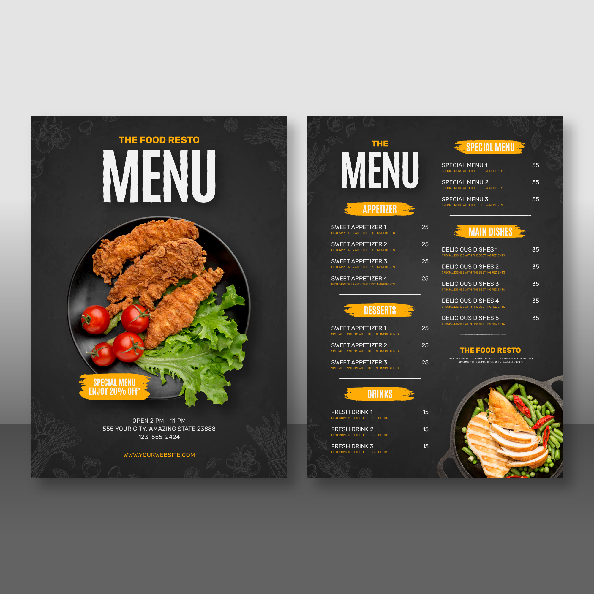
Typography plays a critical yet often underappreciated role in menu design. While food selection, pricing, and layout are typically the first considerations in a restaurant’s branding materials, typography serves as the silent force that guides customer attention, evokes mood, and subtly influences decision-making. In today’s competitive food service landscape, the smallest design details—such as font choice, spacing, and hierarchy—can be the difference between an ordinary dining experience and one that keeps customers coming back.
First Impressions Begin with Fonts
When customers open a menu, the fonts they see establish an immediate emotional connection. Whether they realize it or not, diners are subconsciously interpreting the typeface and judging the establishment. A handwritten script font may suggest a cozy, artisan café, while a sleek, minimalist sans-serif might evoke a high-end, modern eatery. On the other hand, mismatched or poorly chosen fonts can confuse or even alienate patrons. Typography doesn’t just convey the words on the page—it communicates the essence of a brand.
Font choice is therefore one of the foundational elements of effective restaurant menu design. It must align with the overall brand identity and complement the décor, service style, and culinary focus of the restaurant. If there’s a disconnect between how the menu looks and what the restaurant offers, customers may feel confused or misled, which could tarnish their perception before they’ve even taken their first bite.
Readability is Crucial
A beautiful menu is meaningless if it isn’t easy to read. Typography directly affects legibility, and legibility determines how smoothly a customer can scan the menu and make choices. Poorly spaced letters, fonts that are too small, or overly decorative typefaces can frustrate diners—especially in dim lighting, which is common in many restaurants.
To enhance readability, designers must pay close attention to several elements: font size, weight, kerning (space between letters), leading (space between lines), and contrast with the background. A well-designed menu uses these features to guide the reader’s eye effortlessly. For example, increasing the line spacing between menu sections helps avoid visual clutter, and bolding category titles allows users to quickly locate their desired section.
Using multiple font styles (but not too many) can also help create visual contrast. A good rule of thumb is to pair no more than two or three complementary fonts—perhaps one for section headings, one for item names, and another for descriptions. This adds variation without creating chaos.
Typography Influences Choices
Interestingly, typography can influence not just what customers read, but what they choose to order. Psychological studies have shown that menu design can affect buying behavior. Elegant, serif fonts may make dishes seem more refined or expensive, while bold and playful fonts might appeal to families or children.
Moreover, strategic use of type hierarchy—where important items are made to stand out through font weight, size, or color—can draw attention to high-margin dishes or chef’s specials. For example, if a restaurant wants to sell more of its signature burger, setting it in a larger font or a different color than other items can subtly direct attention toward it.
This practice aligns with what is known as “menu engineering,” a method of analyzing the profitability and popularity of menu items and then placing them accordingly. Typography becomes a key tool in steering customers toward more profitable selections without them feeling overtly manipulated.
Emotional and Cultural Contexts
Typography is not just about aesthetics or functionality—it also conveys emotion. The font used for a menu can evoke nostalgia, excitement, sophistication, or comfort. This emotional resonance is essential in shaping the overall dining experience. For instance, a vintage diner might opt for retro-inspired fonts that reflect mid-century American culture, while an upscale Japanese restaurant might use minimalist fonts to match the Zen-inspired interiors.
Culture also plays a role in how typography is perceived. Certain fonts carry associations based on language scripts and traditional uses. For example, Gothic-style fonts may suggest a German heritage, while calligraphic scripts might evoke French or Italian sensibilities. When designing a menu, it’s crucial to consider the cultural context and whether the typography aligns with the intended message.
The Role of White Space and Alignment
White space—also known as negative space—is just as important as the fonts themselves. Typography thrives in an environment that isn’t overcrowded. Adequate spacing between sections, items, and lines improves readability and creates a sense of elegance. Cramped text, on the other hand, can make even the most luxurious menu feel cheap and rushed.
Alignment and layout also contribute to how typography is experienced. Left-aligned text is generally easiest to read and creates a clean, organized feel. Centered text, while often used for aesthetic reasons, can be harder to scan quickly. Justified text (aligned to both left and right margins) may look neat but can result in irregular word spacing that disrupts flow. Every typographic choice, including alignment, needs to be intentional.
Digital Menus and Typography
As more restaurants adopt digital or QR-code menus, typography takes on new dimensions. Screens introduce variables like resolution, screen size, and user interaction. Fonts that work beautifully in print may not translate well to mobile devices, where touch interaction and smaller sizes demand even greater clarity.
In digital formats, scalable web-safe fonts become essential. Responsive design must accommodate varying screen widths, and accessible typography ensures that customers with visual impairments can still comfortably navigate the menu. Consistency across print and digital media reinforces brand identity, making typography a bridge between the physical and digital dining experience.
Brand Consistency and Customer Trust
Consistency in typography builds brand trust. If a restaurant uses one font style on its signage, another on its website, and yet another on its menu, the result is visual dissonance. Customers might perceive the brand as unprofessional or lacking direction.
A cohesive type system should extend across all customer touchpoints, including promotional materials, social media graphics, uniforms, and of course, the menu. This consistency builds recognition, reinforces the restaurant’s personality, and creates a seamless experience from first impression to final payment.
Typography, in this way, serves a branding function as much as a communicative one. Just as a recognizable logo or color palette distinguishes a brand, so too can a distinct typographic style. When done well, it elevates restaurant menu design from a functional tool to a branded experience.
Conclusion
Typography is more than a design flourish—it is the backbone of effective communication in restaurant menus. From setting the tone and guiding the reader’s eye, to influencing purchasing decisions and reinforcing brand identity, typography carries weight far beyond its letters. In the world of restaurant menu design, fonts, spacing, and layout are not just aesthetic choices; they are strategic decisions that shape how customers perceive the food, the space, and the brand.
Ignoring typography is a missed opportunity. Embracing it with purpose can transform a simple list of dishes into a compelling, memorable part of the dining experience.