How Packaging Colors Affect Consumer Mood and Perception
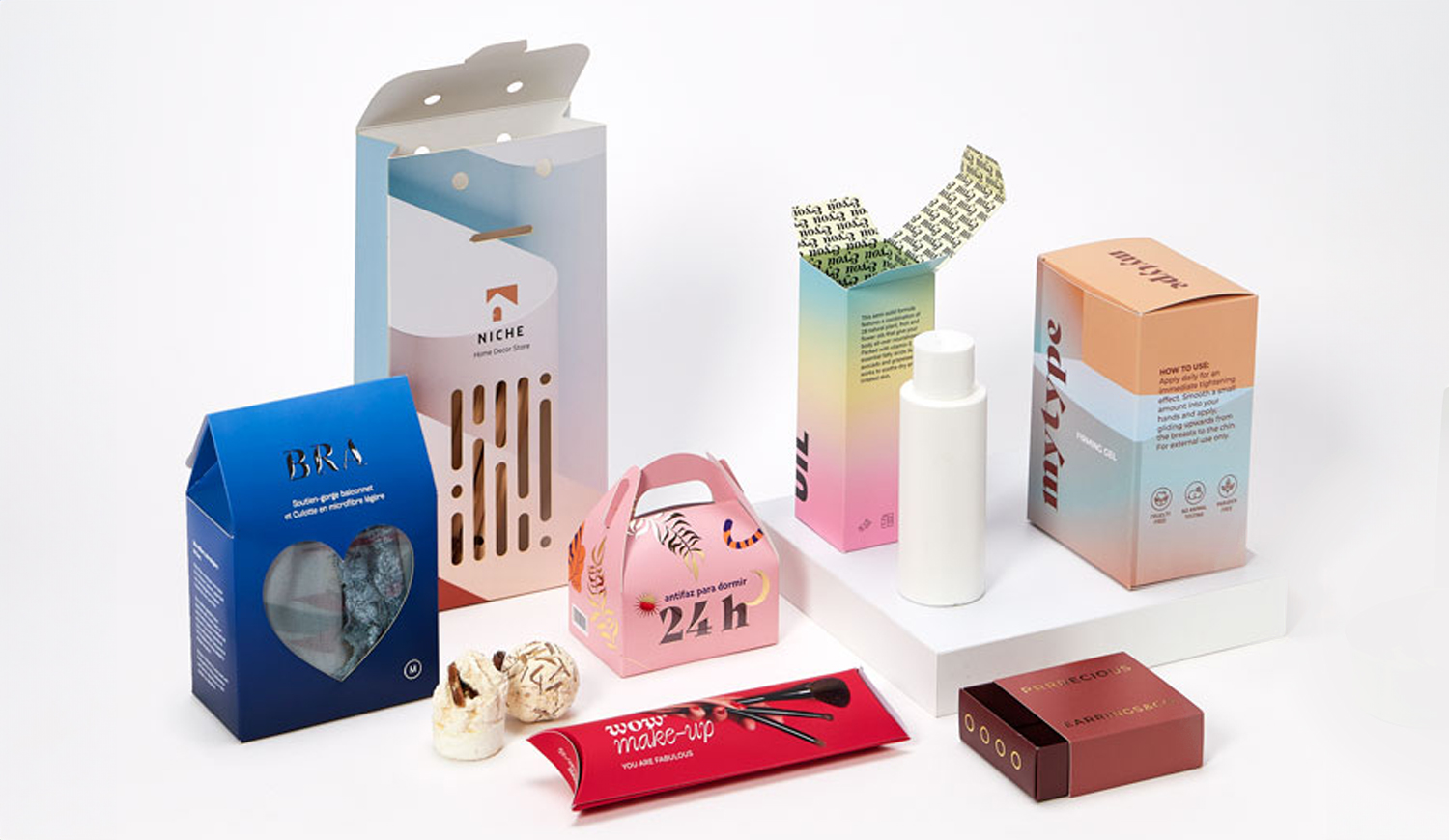
Colors play a powerful role in influencing consumer behavior and perception, especially when it comes to packaging design. From the moment a consumer encounters a product on a shelf or in an online image, the packaging’s color palette can evoke emotional responses, influence decision-making, and shape the perception of a brand’s identity. At ThePackagingTree, we understand the psychological effects of color and how it can be leveraged to enhance product appeal, boost sales, and reinforce brand messaging.
The Psychology of Color in Packaging
Color psychology is the study of how colors influence human emotions and behaviors. When it comes to packaging design, colors can trigger specific psychological responses that shape how a consumer feels about a product and its brand. Different colors evoke different emotions and perceptions, making them essential tools for marketers and designers to create a connection with their target audience.
For instance:
- Red: Often associated with excitement, passion, and urgency, red can stimulate appetite and attract attention. It is commonly used in food packaging, especially in fast-food and snack industries.
- Blue: Blue is typically linked with trust, calmness, and reliability. It is widely used in packaging for healthcare, finance, and technology products, as it conveys a sense of professionalism and dependability.
- Yellow: This color is bright, cheerful, and energetic. It grabs attention and creates a sense of positivity and optimism. Yellow is often seen in packaging for products that are fun or aimed at younger demographics.
- Green: Green symbolizes nature, health, and sustainability. It is a popular choice for eco-friendly, organic, or natural products, as it suggests freshness and well-being.
- Black: Black is elegant, sophisticated, and powerful. It is frequently used in high-end, luxury packaging to communicate exclusivity and premium quality.
- Orange: Orange is stimulating, energetic, and friendly. It is commonly used in food and beverage packaging, especially for products targeting active or young consumers.
How Packaging Colors Influence Consumer Perception
The colors used in packaging not only influence emotional responses but also affect how consumers perceive the product and the brand behind it. Packaging colors can signal the quality, taste, and even the value of a product, all before the consumer opens it or tries it.
Perceived Quality and Luxury
Colors such as black, gold, and silver are often associated with premium, high-quality products. Luxury brands use these colors to convey sophistication, elegance, and exclusivity. The choice of color can elevate a product’s perceived value, making consumers more likely to view it as a premium offering. For example, luxury cosmetics and high-end beverages often use matte black or gold foiling to communicate a sense of high value and quality.
Brand Identity and Consistency
Packaging colors are integral to reinforcing a brand’s identity and ensuring consistency across different product lines. A well-thought-out color scheme helps create recognition and strengthens brand loyalty. Consumers quickly associate specific colors with certain brands, making them more likely to trust and choose familiar products. For instance, Coca-Cola’s iconic red and white color scheme immediately identifies the brand and reinforces its association with refreshment, energy, and enjoyment.
Emotional Connection
Packaging colors also play a significant role in fostering emotional connections between consumers and products. For example, green packaging often appeals to eco-conscious consumers because it is linked to environmental sustainability. Similarly, bright colors like yellow or orange can evoke feelings of happiness and excitement, making them ideal for products that are designed to bring joy or make people feel good.
The Impact of Color on Consumer Decision-Making
The influence of color on consumer behavior extends beyond just emotions and perceptions—it directly impacts decision-making at the point of purchase. Research shows that up to 85% of consumers make purchasing decisions based on color alone. As a result, the colors used in packaging can significantly influence whether a consumer picks up the product or chooses a competitor’s offering.
Attention-Grabbing Colors
In a crowded retail environment, standing out on the shelf is crucial. Bold and contrasting colors attract attention and draw consumers in. Bright colors like red, orange, and yellow are particularly effective at catching the eye, while more muted tones like gray and beige may go unnoticed. Packaging that uses a color palette that contrasts with its surroundings can help a product stand out, increasing its chances of being noticed and selected.
Color and Consumer Trust
Consumers also associate specific colors with trustworthiness. Blue is widely regarded as the most trustworthy color, which is why it is often used in industries like healthcare, finance, and technology. By incorporating blue into packaging, brands can evoke feelings of reliability and security, which can lead to greater consumer confidence and loyalty.
Cultural Considerations in Color Choice
While color psychology provides valuable insights, it’s also important to consider cultural differences when selecting colors for packaging. The meaning of certain colors can vary significantly across different cultures. For example:
- In Western cultures, white is associated with purity and peace, while in some Eastern cultures, it is linked to mourning and death.
- Red is considered lucky and celebratory in many Asian cultures, but in some parts of the world, it can symbolize danger or warning.
- Green is seen as a symbol of health and nature in many cultures, but in some places, it can be associated with envy or greed.
For brands operating in global markets, understanding the cultural significance of color is crucial to avoid unintended negative connotations and to ensure that the packaging resonates with local audiences.
The Role of Color in Eco-Friendly Packaging
As sustainability becomes an increasing priority for consumers, the color of packaging can also signal eco-friendliness. Green, brown, and earthy tones are often associated with nature and sustainability. These colors are commonly used in packaging for organic or environmentally conscious products, creating an immediate connection between the product and its eco-friendly attributes. Brands that incorporate these colors into their packaging can reinforce their commitment to sustainability and attract environmentally aware consumers.
Testing and Optimization of Packaging Colors
Because colors can have such a profound effect on consumer perception and purchasing decisions, it’s essential for brands to test and optimize their packaging colors. A/B testing and focus group studies can help determine which colors resonate best with a target audience, leading to improved product performance and higher sales. At ThePackagingTree, we help brands design and test packaging colors that align with their brand image, target demographic, and marketing objectives.
Conclusion
Packaging colors are a powerful tool in shaping consumer mood and eco friendly cosmetic packaging perception. By understanding the psychology of color and how it influences decision-making, brands can design packaging that not only attracts attention but also builds trust, communicates quality, and fosters emotional connections with consumers. Whether you’re launching a new product or refreshing your brand, selecting the right color palette for your packaging is key to standing out in a competitive marketplace and ensuring lasting consumer loyalty. At ThePackagingTree, we specialize in creating packaging designs that harness the power of color to elevate your brand and enhance customer engagement.


Post Comment