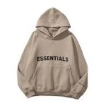
Essentials Hoodie Visual Identity and Design
Essentials Hoodie: Visual Identity and Design
In the ever-changing world of fashion, few garments have managed to blend simplicity, luxury, and relevance quite like the Essential Hoodie. As a core piece from the Fear of God Essentials line, this hoodie represents far more than comfortable apparel—it is a symbol of minimalist fashion, understated identity, and modern cultural resonance. Its visual design and branding are deliberately crafted to make a lasting impact while retaining an effortlessly cool aesthetic. Through clever design decisions and subtle but powerful cues, the Essentials Hoodie has established itself as a wardrobe staple for fashion enthusiasts around the globe.
A Philosophy of Minimalism
The visual identity of the Essentials Hoodie begins with its commitment to minimalism. Rather than relying on bold graphics, complex prints, or flashy logos, the brand leans into clean lines and neutral tones. This minimalism is not just a design choice—it reflects a broader design philosophy rooted in quiet luxury and refined streetwear.
From the neutral color palettes—such as taupe, black, cream, and grey—to the soft silhouettes and relaxed fits, the Essentials Hoodie communicates confidence through subtlety. It allows the wearer to express style without shouting, creating a blank canvas for individual interpretation.
The Logo: A Study in Simplicity
One of the most iconic visual elements of the Essentials Hoodie is the logo itself. Often placed across the chest, back, or subtly on the hood, the “ESSENTIALS” text is rendered in a clean sans-serif font. It is typically capitalized and evenly spaced, creating a sense of balance and visual harmony.
The simplicity of the logo reinforces the brand’s understated aesthetic. There is no need for intricate artwork or oversized branding. Instead, the name “Essentials” speaks volumes—it suggests timelessness, quality, and necessity, all in one word. In many iterations, the Fear of God name is added beneath the “Essentials” text, tying the hoodie to the high-fashion credibility of the parent brand.
Color as a Brand Element
Color plays a pivotal role in the visual identity of the Essentials Hoodie. The palette is intentionally neutral, designed to reflect the brand’s belief in versatile and timeless fashion. Earth tones and monochromatic hues dominate, promoting ease of styling and a unified look.
By limiting the color spectrum, Essentials strengthens brand cohesion across collections. Whether it’s a sand-colored hoodie or a charcoal grey version, there’s a visual consistency that makes each piece unmistakably part of the Essentials universe.
The rare release of bolder colors—like navy or pistachio—feels curated rather than random. These limited drops generate excitement while preserving the brand’s overall aesthetic integrity.
Silhouette and Fit
The Essentials Hoodie is characterized by an oversized, relaxed fit—a nod to both streetwear trends and comfort-driven design. Dropped shoulders, roomy sleeves, and slightly elongated body lengths give the hoodie a distinctive shape that complements a wide range of body types.
This silhouette is key to its visual appeal. It creates a casual, laid-back look that feels modern and wearable. The fit makes the hoodie feel elevated, even in its simplicity, allowing it to be styled with anything from sweatpants to tailored trousers or sneakers to designer boots.
Fabric and Texture
Visual identity is not only about color and graphics—it’s also about how a garment feels and drapes. The Essentials Hoodie is typically crafted from premium heavyweight cotton or cotton blends, which give it a structured yet soft feel.
The tactile quality of the fabric adds depth to the hoodie’s visual appeal. The smoothness, weight, and fall of the material make it look and feel luxurious, reinforcing the brand’s connection to both comfort and quality.
Details such as ribbed cuffs, kangaroo pockets, and double-stitched seams enhance both form and function. Even without loud branding, these design elements make the hoodie stand out as a high-end product.
Cohesive Branding Across Mediums
Essentials ensures its visual identity is consistent across product packaging, digital presence, and social media. Product tags, website layouts, and promotional photography all mirror the hoodie’s minimalist aesthetic.
Photoshoots often feature muted backdrops, monochrome clothing pairings, and natural lighting. Models are styled in a way that aligns with the hoodie’s purpose: practical, neutral, modern. This visual language appeals to a broad audience—from luxury consumers to everyday wearers—without losing its high-fashion credibility.
Timeless Yet Modern Appeal
Perhaps the most remarkable aspect of the Essentials Hoodie’s design is its timeless appeal. It doesn’t rely on trend-based graphics or seasonal gimmicks. Instead, it offers a look that remains relevant regardless of fashion cycles. This commitment to timelessness reinforces the brand’s identity and earns long-term loyalty from consumers.
The hoodie becomes not just a garment, but a visual statement about quality, purpose, and identity. It’s fashion stripped down to its most essential form—precisely what the brand name suggests.
Conclusion
The visual identity and design of the Essentials Hoodie speak volumes in their simplicity. Through minimalist aesthetics, thoughtful branding, premium materials, and cohesive styling, it has become a cultural icon in contemporary fashion. essentials sweatpants It offers more than just a stylish layer—it offers a philosophy of elegance through restraint. Essentials proves that in a world full of noise, sometimes the most powerful statement is a quiet one.


